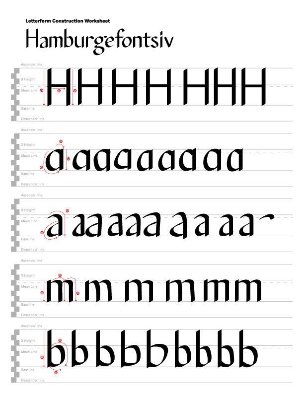
In the first image that I am showing is when I was doing the fonts for H,A,M,and B. The leather that I had struggled with with the most is both of the A's. They both have a specific way where you have to draw them. I found it really difficult as sometimes it didn't look proper because there was too much space in between. Like in the bowl of the 'a'. I also had to consider the stress when it came to each leather and the spacing between the ages as well. Sometimes the H would be too wide.
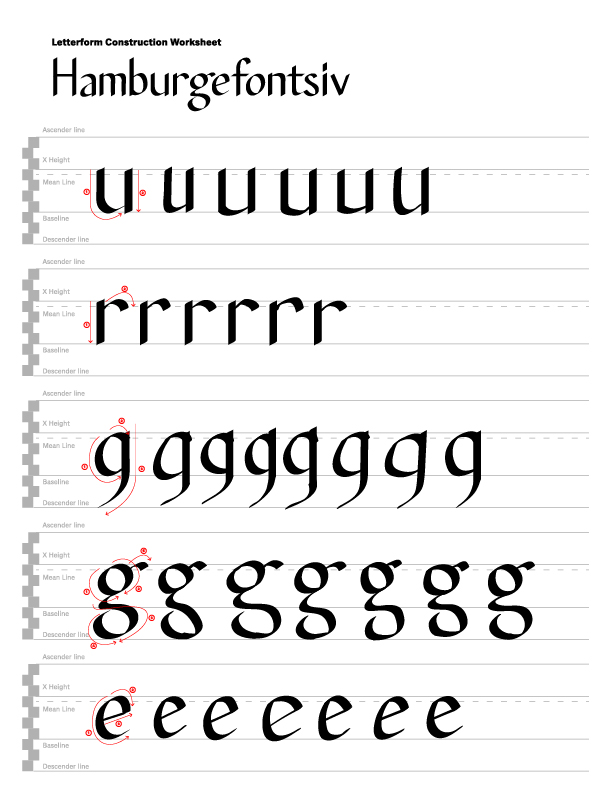
An image 2, I had to do U, R, G and E. I felt like this one was also a struggle because of the you and the spacing between it. The R and having the stress line be thinner. But I feel like the most struggle that I had with this was the GS because of the link and loop. I have to try it multiple times to get the 'g' proper because of the link being too wide or not in the right place when I was drawing out the G. also, when it came to the loop. Sometimes I made the loop to wide or to diagonal. Another leather that I had struggles with is to eat because it was too slanted. I kept on messing up with the eye of the 'e'.Also trying to get the stress points right sometimes it would be too diagonal and other times it wouldn't have the proper stress.
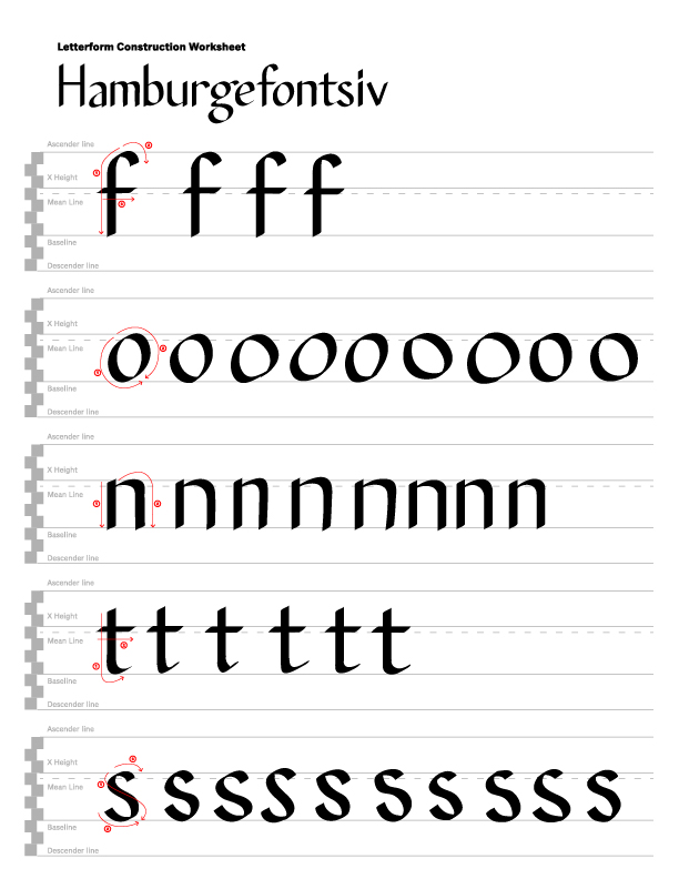
An image 3, an image three I had to do F, O, N, T, and S. The letter that I struggled with the most was probably the O because of the stress and the direction of how the O was drawn. I honestly thought it would be easy but when I try to do the O over and over again, it turns out that I was wrong. When I was doing the oh I kept on messing up and having the stress be two on the side instead of it being more upright, so I ended up looking a bit off another leather that I had struggles with was the S because of the spine and the beak.When drawing the S I kept on making it more diagonal again instead of it being more upright, so I kept on trying it over and over again.
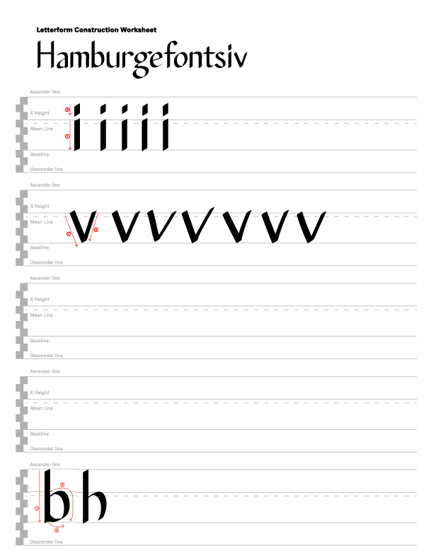
An image 4, I ended up doing a little more letters, such as i and v because I wanted to practice more of the spacing in between the different letters because with the V, I struggled with the stress of one of them and it kept on going more towards a diagonal side again instead of it being more upright and you can tell that one vertex was bigger than the other. I also wanted to work on the stem with the lowercase eye because I felt like the spacing wasn't proper so I just wanted to practice a little more.
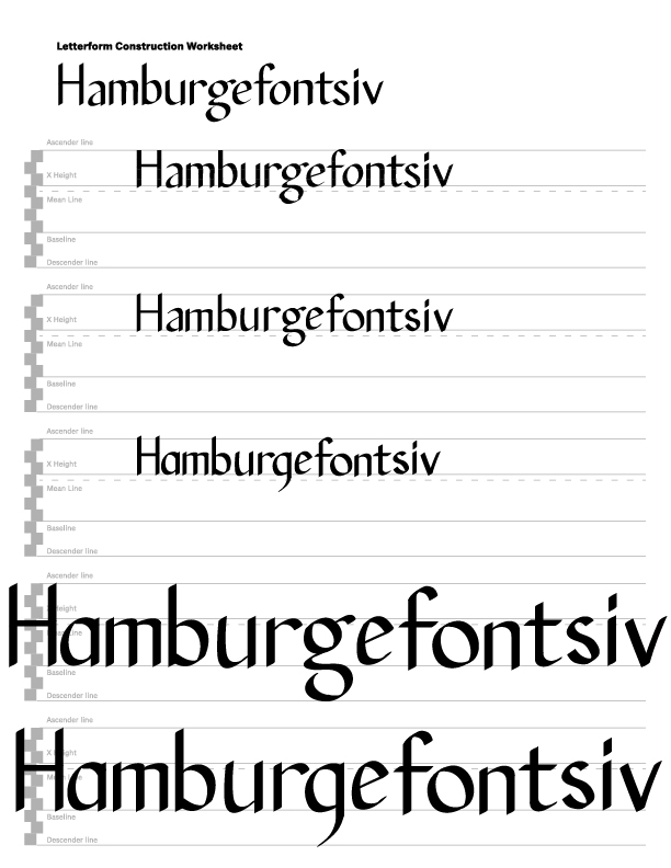
An image 5, we had to put the fonts together and this was probably one of the hardest ones that I had to do because I realize that at first I tried to do it just by eyeballing it. in my eyes, it looked to be like the spacing was right, but when I use the guidelines in illustrator, it turns out that I was completely off and the spacing wasn't right because of some of my leathering that I did wasn't right as well. Then I had to go back to doing multiple Letters to make sure that I was actually making the Leather formatting right and the spacing right.
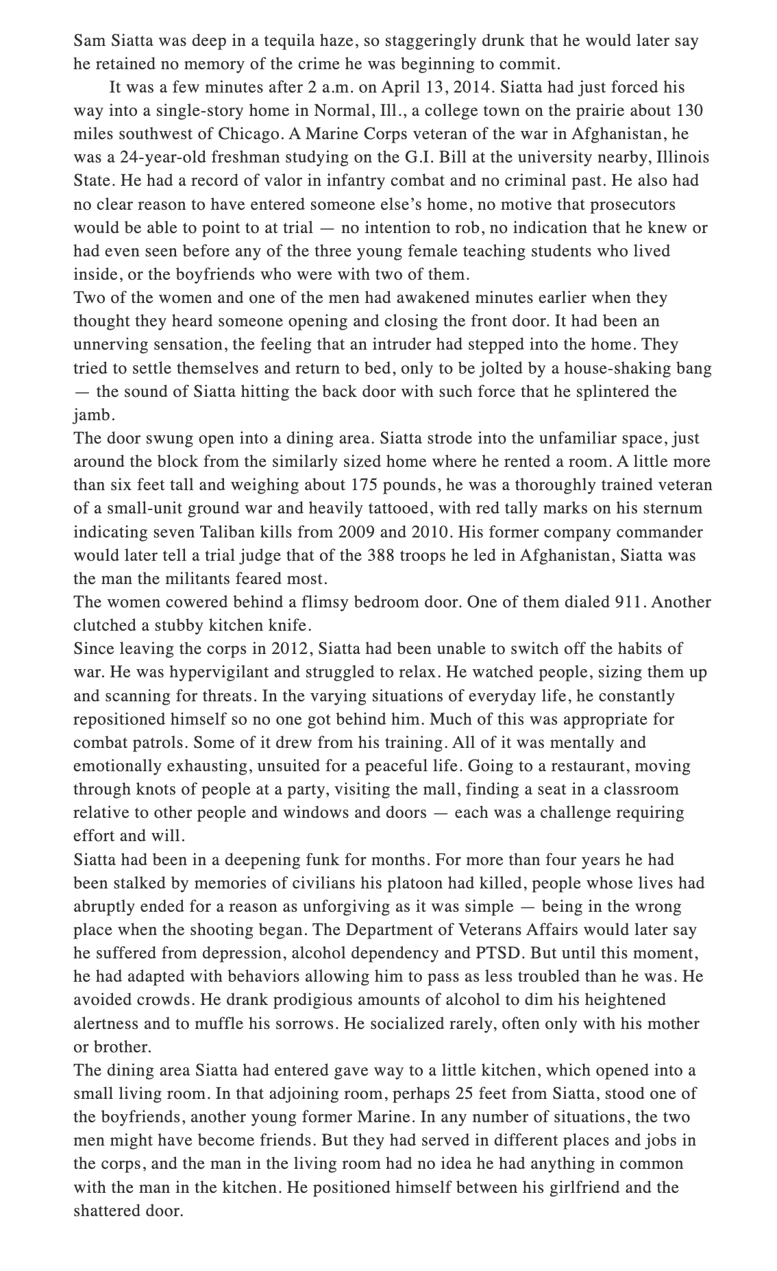
An image 6, I was playing around with some of the type when it came to the paragraph above. I believe this was Times new Roman, which is the default state of the paragraph so I decided to change it up.
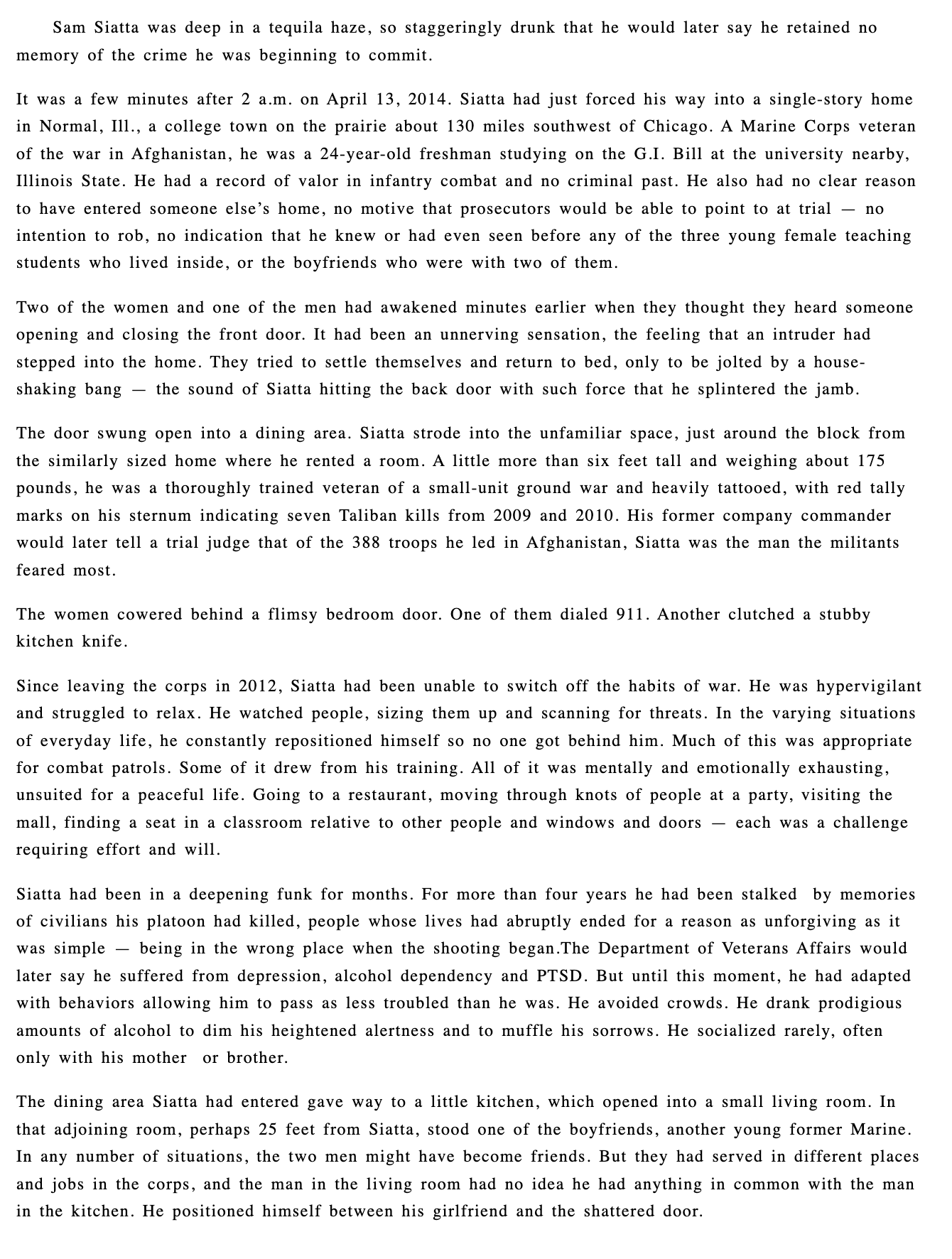
An image 7, still trying on different fonts to see what looks good
An image 8, I was also playing with the spacing in between the leading between the paragraphs and I wanted it to be a little more smaller because when having the sentences to spaced out, it distracts the reader and makes it harder to read so then I decided to make a little bit smaller, so it is more closer together
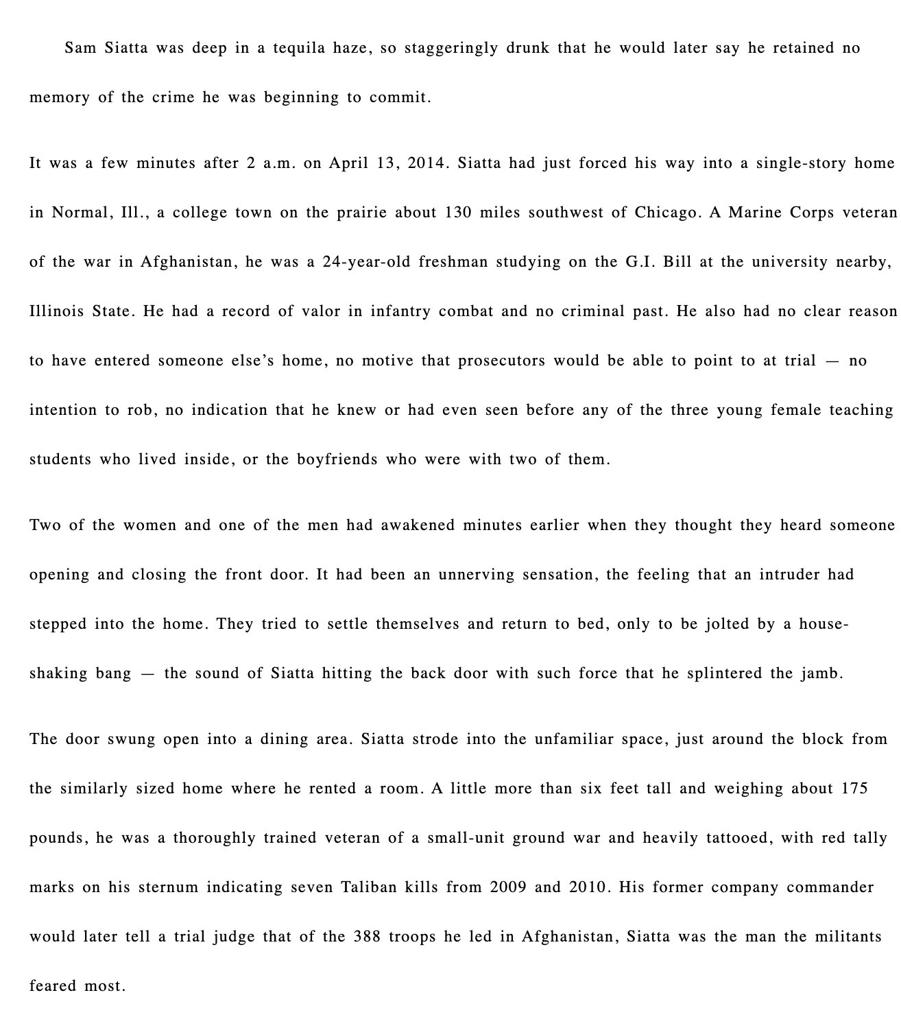
An image 9, I also realized the column was a little bit too wide when it came to reading the paragraph so I decided to make the width of it 80% instead of 100% because then it's easier for the user to read in my opinion.
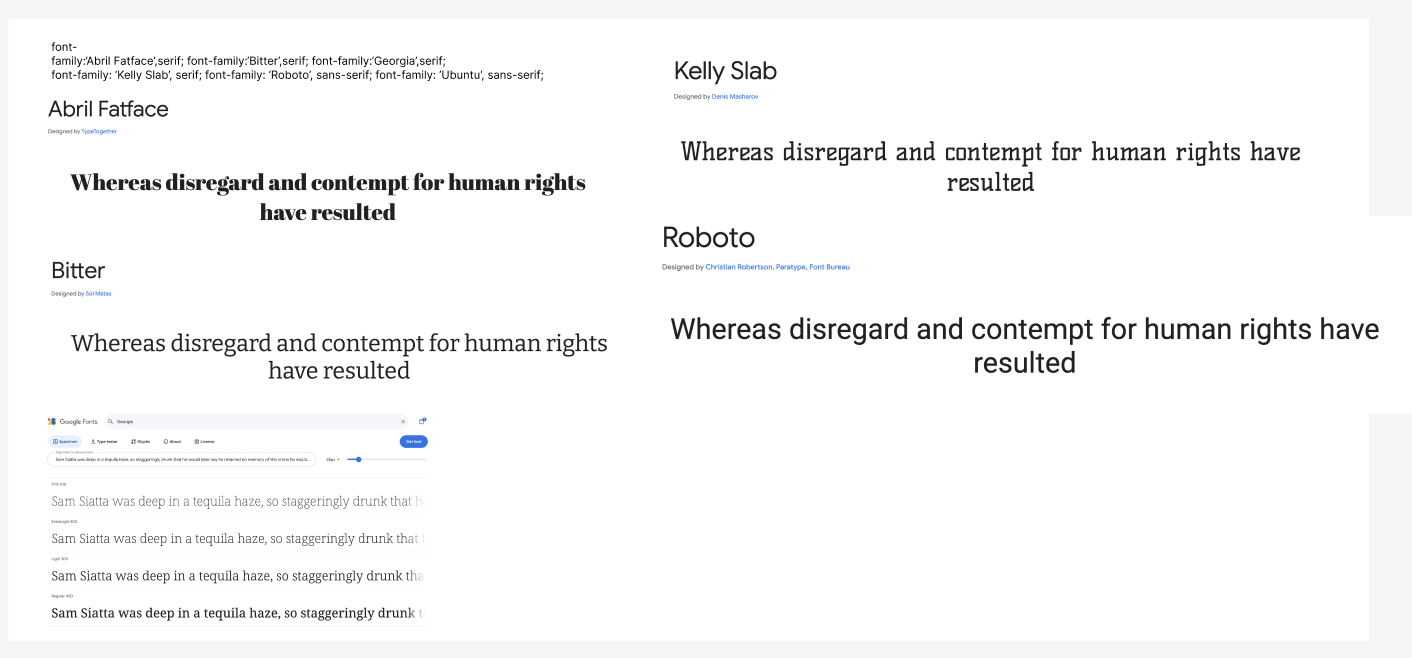
An image 10, I also went on Figma and searched up the different fonts that I wanted to maybe use and some of the fonts did not work with how I originally wanted the paragraph to look like and there was difficult to read.